
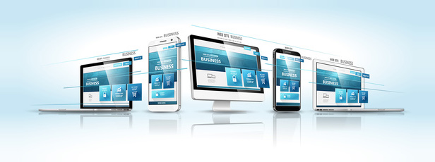
With mobile traffic skyrocketing to all time highs, now accounting for almost 60 percent of all internet traffic, responsive web desgin (RWD) is no longer an option or a luxury—it is essential.
So what exactly is RWD, and why is it so important?
Responsive design is an approach to web design aimed at crafting websites with optimal viewing and interaction, including easy reading and navigation with a minimum of resizing, panning, and scrolling, across a wide range of devices from desktop computer screens to mobile phones.
More than ten years ago, Google began to boost the ratings of mobile-friendly sites for all searches made from a mobile device. The net effect of this penalizes websites that are not yet mobile-friendly. Today the mobile web is upon us. It’s vital that you have a website optimized for it.
If you want to maximize the search rating and page rank of your site, as well as achieve optimal viewing across all mobile devices, Dexign can help you. FastTrack responsive sites offer all of this functionality and more, including current-generation HTML5/CSS3 (Living) codebase.
View Pricing